Overview
Role: UX/UI Designer
Timeline: 10 Weeks
Tools: Figma, InVision, Pen and Paper
Project Type: End-to-End Capstone Project
Cycling is a sport as much as it can be a person’s mode of transportation and connection to their city or surroundings. Whether you’re undertaking an expedition across a country or your neighbourhood, cyclists experience mechanical issues. Understanding what to do when that happens is often a stressful situation.
Problem Space
All bicycles experience issues, how can we help?
This project was designed to help cyclists make decisions about their equipment’s maintenance. The goal was to present fixing a mechanical issue yourself to be just as valid as enlisting the help of an experienced mechanic at your local bike shop.
When things go wrong, we have WheelBase
The two paths to solving an issue are presented equally and are easily compared
Doing the repair yourself
Clearly laid out steps with video instruction
Expectations for time and difficulty
Call to action - To access the comparison modal
Accessing a bike shop for that repair
Bike shop directory tailored to local businesses capable of performing that repair
Expectations for time and cost displayed clearly
Call to action - To access the comparison modal
Comparison Modal
Materials, tools and labour charges broken down for each method
CTA buttons allowing the user to move to a specific list of shops selling or providing the service, tools and materials they will need
Totals laid out for each path to not put emphasis on the cheaper or easier path, removing stigma around either method
Solution
Initial Research
My experience as a cyclist and mechanic left me with assumptions going into the research process
Most cyclists don’t know what is involved with fixing their equipment
Consumers don’t know how to accurately compare the cost of a quoted repair to purchasing tools and fixing their bike themselves
New cyclists have less mechanical experience than cyclists with more experience
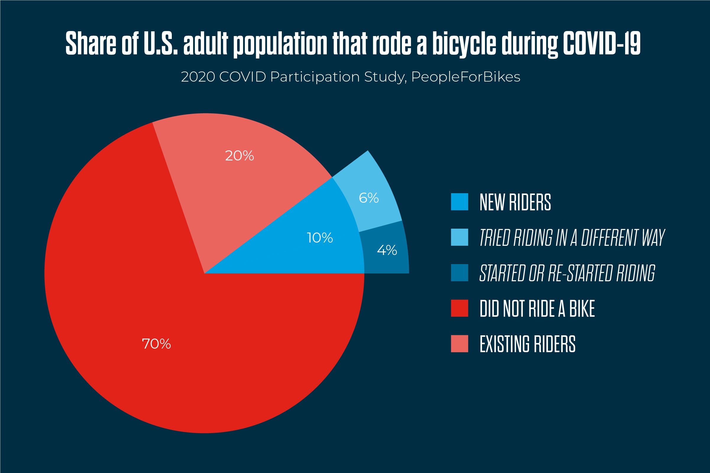
What we can show from this research
Our biggest group (new cyclists) are a growing demographic.
So let’s talk about how we got here
How Might We:
Help new cyclists solve mechanical issues that arise in order to decrease frustration and promote understanding of bicycle maintenance?
We found data to support our problem space, we now know who this problem effects most is a significant population.
Let’s talk to the users:
From the interviews, some major themes started to emerge and were then plotted on an affinity map.
Interviewing 3 users that met the basic criteria of:
Cycling less than 5 years as an adult
Has not worked in the cycling industry
Had at least one mechanical issue
Has interacted with a bike shop
The insight I gained:
How cyclists feel when a mechanical issue occurs
What resources they want when issues arise
How they interact with and select the bike shops they frequent
From here, I took the major themes of the interviews and put together a persona to better remind myself and other who I was designing for.
User Interviews
Meet, John.
With a persona formed, I could now explore what the users will need to accomplish with the product. I built an experience map to better visualize these tasks and opportunities for intervention.
Opportunity 1 - John can review what tools he will need
Opportunity 2 - Our user can search for shops that meet his requirements
Opportunity 3 - The ability to compare quotes and make a more informed decision
I then completed a task flow diagram to put context on what our persona is going to accomplish within the task of fixing a flat tire.
Persona
Ideation
With an idea of what I was building, who it was for and with their needs in mind, it was finally time to start ideating and sketching solutions.
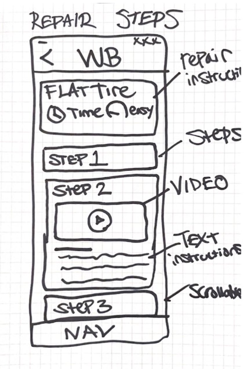
I found UI examples of cards and steps being displayed in various ways and played around with those ideas on pen and paper.
One of the main things I discovered in this process was that the copy I chose felt like it was incredibly important, this would be a theme through the rest of the project.
The progression into a more refined version of the sketches took form. This exercise was helpful in working out the bigger ideas, and will remain a big aspect of my process in the future.
Initial Prototype
When working alone on a project I can run with an idea and see it to its end before deciding to pivot. It is notable that I started altering wireframes into a low to mid fidelity version without thinking. Rapid prototyping is part of my process when working alone on a project.
It was now time to test these ideas, and better understand how users would react to the product and learn from their feedback.
User testing was conducted on 5 users, and their feedback was plotted on a prioritization matrix. Feedback or changes were weighed by how impactful they would be to the product and how much effort they were to implement.
The main insights from the first round were centred around copy and technical terms related to bicycle repair, some of this was unavoidable, but a happy medium was found in most cases.
Although tempting to only consider low effort/high impact changes, several changes were made that were considered higher effort to implement as there were several users having the same issues. Such as this example of the home screen and it feeling incomplete and copy confusing the users with where to start their task.
Version 1
Version 2
A second round of testing was completed on 5 users. In some cases the users were the same as they offered great insights and helpful feedback. The additional dimension of the repeat testers perspective on the changes made from version 1 to 2 were unique and an aspect of testing I would repeat in future user testing rounds.
Colour and branding
As we now sat at our third version of the product, it was time to breathe life into WheelBase
Brand inspiration was gathered, to reflect the calm and clear experience that I was going for.
I then pulled colour from some of the images and kept the lighter feel of this board after building one that was too dark and serious in tone.
This collection of copy, button style and shape allowed for some experimentation. There were many iterations of this example before arriving at this version.
The orange hue would be my main colour, and the red would serve as an error state colour that would almost never be used. Nunito font was explored here too, and was selected for all copy within the product.
WheelBase - Not many other titles were explored as the name has a bicycle specific meaning and during informal testing, people responded well to the name compared to others.
I did however sketch out many versions of the wordmark on paper, but ultimately hated all of them or felt it was the wrong feel and didn’t match the rest of the product’s presentation. I ultimately found a font named Adventuro and felt it translated perfectly for the title of the app.
Beyond the mobile
With our brand identity intact, it was time to build marketing materials
I used the main brand colours to keep the presentation cohesive. The calm delivery within the app needed to be contrasted with photography that matched the user experience. I removed the colour from the photos, and put splashes of colour on top of them to tie them into the experience and branding.
Next steps
Here in this example of the UI imagined for AppleWatch. The video steps would auto repeat with a 5 second delay before starting again so that the user wouldn’t have to to put the tools or component down to replay the step. Using voice activation for this same scenario is also a thought I’ve had and would like to explore.
My thoughts on further developing the product would be to consider accessibility beyond the basic needs of readability.
Learnings and reflection
Through this 10 week journey I refined my understanding of the end-to-end UX process and learned how to build effective solutions to human problems.
Some of my takeaways from this project:
The process is never linear - The way I reached solutions was almost never the path I expected to find myself on. I found that as exciting as it was interesting
Hold off on the solution - Keeping the perspective that I was not designing for myself at the forefront, and to trust the (well established) UX process
Done is better than perfect - I still feel like I have more to learn here, but my changes and iteration process did get more efficient towards version 3 of the prototype
Keep revisiting the problem - My mentors would reminding me through the 10 weeks, but it will forever be in the back of my mind because it rang true so often when I would get stuck and find my way back on course because of it


